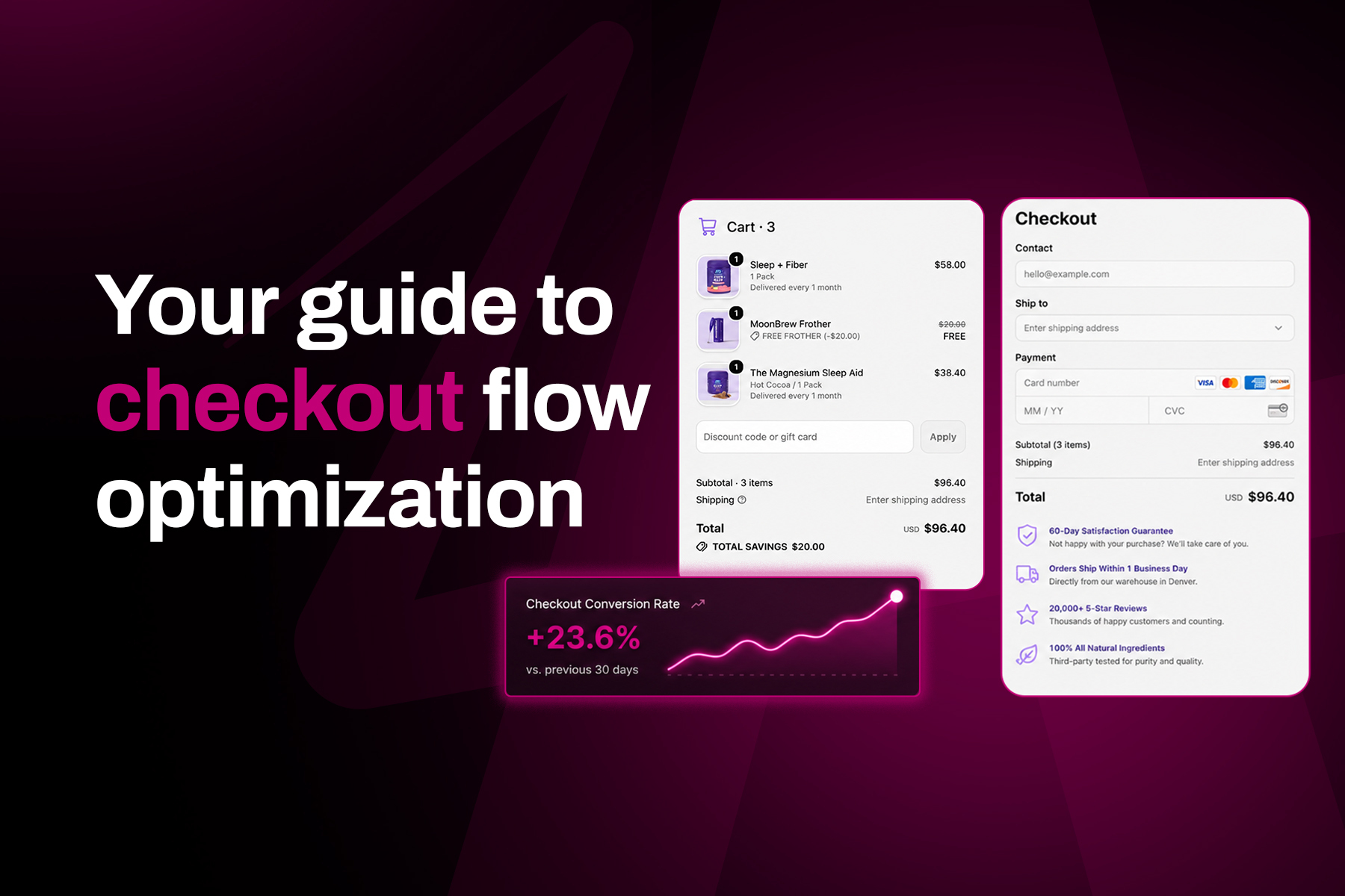
Cart abandonment rates are staggeringly high, with roughly 7 in 10 carts never becoming orders.
Shoppers abandon their carts for many reasons, from hidden costs to forced account creation. But regardless of the reason, the journey is usually the same: a shopper adds products to their cart, clicks to checkout, hits one or more points of friction, and then bails.
There's a bit of irony there—the checkout flow breeds abandonment, but it's also the highest-intent point on the entire site.
The goal is simple: keep that intent alive until the "Buy" button is safely clicked. To do that, brands need to optimize their checkout flow to reduce abandonment and drive incremental value at the same time.
At Aftersell, we see checkout behaviour across 40,000+ Shopify brands. Not sure if you're a numbers whiz, but that's a lot. That means we have the data to show you how top brands reduce abandonment across the flow, intercept high-intent moments with well-placed offers, and recover shoppers who still slip away.
Let’s get started.
What is checkout flow optimization?
Checkout flow optimization is the process of improving the entire path from cart to confirmation, including any recovery sequences that follow. When done strategically, it leads to fewer abandoned carts and higher AOVs from customers who complete a purchase.
Brands often lump together several different goals: reducing checkout friction, increasing AOV through strategic offers, and recovering abandoned carts through follow-up flows. All of these play an important role, but checkout flow optimization ties them together.
Despite its importance, precise checkout optimization can sometimes get lost in the shuffle. If there’s friction during the most important part of a customer’s journey, it doesn’t matter what else you’ve done.
Why cart abandonment reduction starts at checkout
We’ve all been there: you build a cart, head to checkout, and… You see the total price skyrocket from unexpected fees like shipping, tax, and duties.
It’s not fun, and 48% of shoppers agree: unexpected extra costs are the single most-cited reason shoppers abandon their cart.
The checkout page plays two important roles, which makes it a heavy lift. It’s where sticker shock lands, with fees, tax, shipping, and everything else suddenly making their grand entrance. It’s also the point where the shopper is most invested.
A customer who reaches the checkout page has already come so close to buying. That hesitation over the total isn’t worth giving up on. They’re a high-intent buyer looking for a reason to feel good about the number.
Checkout flow optimization can help you give them one.
7 checkout flow optimization strategies that reduce cart abandonment
This might sound a little out of left field, but your checkout is actually one of the best places to upsell your customers. You just need to do it at the right time, with the right products, in the right place, all without breaking checkout best practices.
Once your checkout flow is in a good place, it’s time to optimize with these 7 strategies.
Build a friction-free checkout foundation
Before fine-tuning offers, walk through the ecommerce checkout process the way a customer would—from product pages and the shopping cart to the payment process and confirmation page.
A complicated checkout process creates friction points that can derail an otherwise smooth online shopping experience.
That walkthrough helps you optimize the checkout experience around a simple user experience: clear choices, few interruptions, and an obvious next step. For any ecommerce site, the baseline goal is a streamlined, user-friendly purchase process.
Make guest checkout the easy choice
Start with a visible guest checkout option and let first-time shoppers choose whether to create an account after they buy.
Forced account creation can interrupt intent, while guest checkout helps potential customers move forward faster. Keep form fields to the minimum you truly need, enable autofill, validate entries in real-time, and use progress indicators when checkout spans multiple steps.
A clear CTA—whether it says “Buy now” or “Complete order”—should remain easy to find. Remove popups and nonessential notifications that compete for attention.
Offer placement changes everything
Our data from 40,000+ brands has shown one common trend: upsell offer placement can significantly impact offer acceptance rates, conversion rates, and AOV lift.
Location truly is everything. The exact same offer placed at different points in the flow can swing acceptance by more than 30x and AOV by roughly 5x.
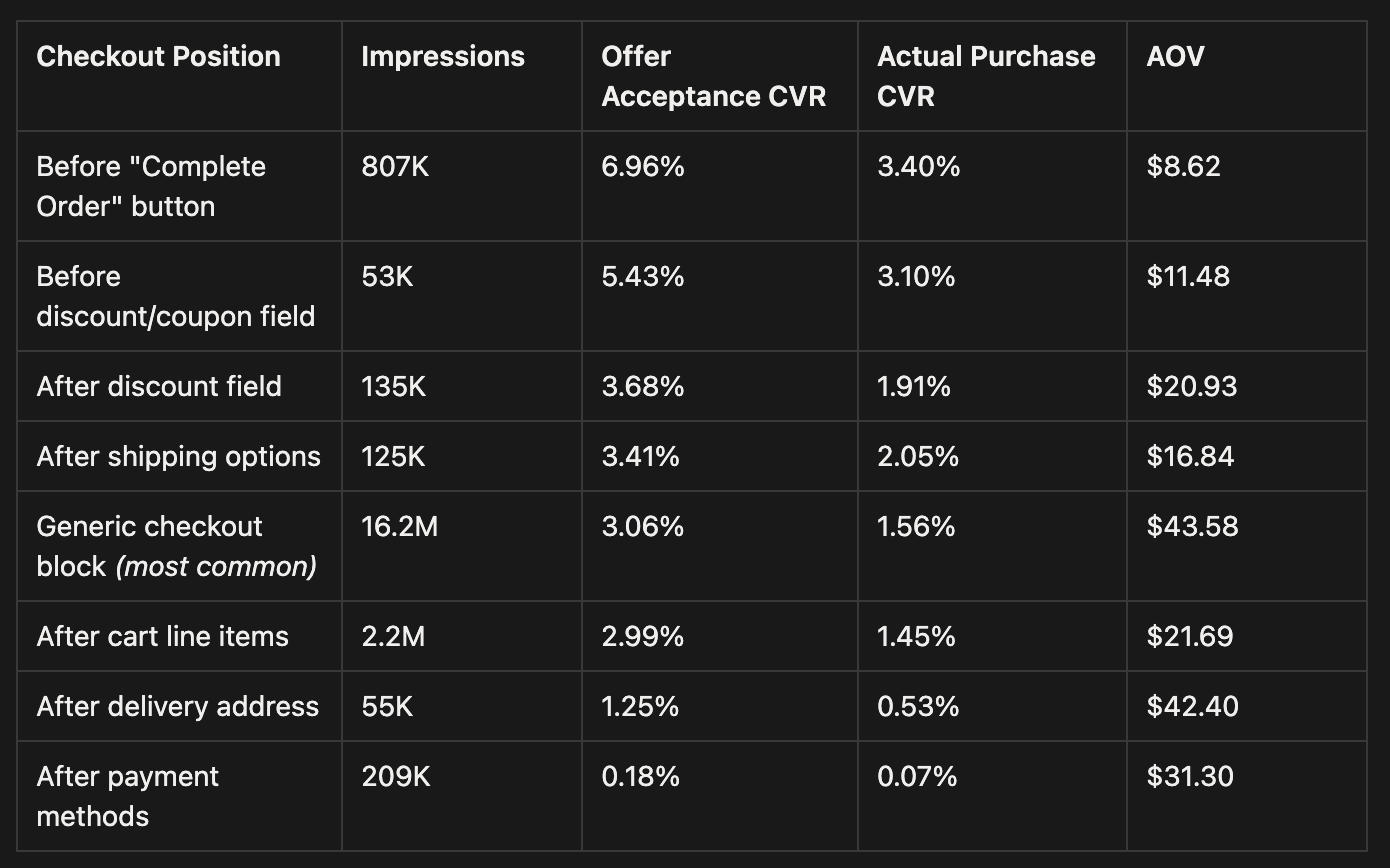
Indulge us for a moment as we dive into these stats:
- Highest acceptance rate: The slot right before the “Complete Order” button has the highest acceptance by far at 6.96%—more than double the common block. It also has the lowest AOV at $8.62. This makes the placement perfect for low-cost impulse add-ons when you want to maximize acceptance.
- Most revenue per impression: The generic checkout block earns the most revenue per impression. With a $43.58 AOV, it more than makes up for the lower 3.06% acceptance rate. This makes the location a better fit for higher-ticket upsells that shoppers need a little more time to consider.
- Least compelling: The slots after the delivery address and payment step are the least compelling. With 1.25% and 0.18% acceptance rates, they’re evidence that the shopper has mentally checked out (get it?) of the checkout flow and they’re ready to exit.
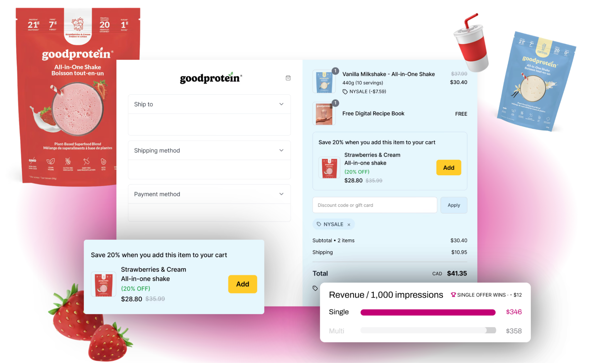
Your offer placement depends on your goal and the type of offer you’re, well, offering. Are you trying to increase acceptance for low-ticket items you need to clear out of inventory? Do you need to boost basket size with higher-ticket items? The answer should shape where your offer appears.
While trialing and implementing different placements might sound challenging, it’s super easy with Aftersell. With our no-code checkout designer, you get full control of placement, layout, and offer copy—all without touching a line of code.
Match the offer to the moment
What you’re offering is just as important as where and when you’re offering it.
With Aftersell, you get three options for offer types:
- Single-product upsell: The classic—one product with an Add to Cart button.
- Multi-product upsell: Several products in a stack or carousel that allows the shopper to accept more than one.
- Checkmark upsell: A single low-cost add-on that the shopper accepts with a checkbox instead of a full Add to Cart button. Best for simple, fast-decision items like shipping protection or gift wrapping.
Matching the right product to the offer type is key here. You can:
- Hand-pick specific products during seasonal sales
- Pull from a collection
- Let AI recommend products based on cart contents
- Re-offer the most expensive item in the cart
- Or use a spend threshold that points shoppers to low-friction products that will close the gap for free shipping.
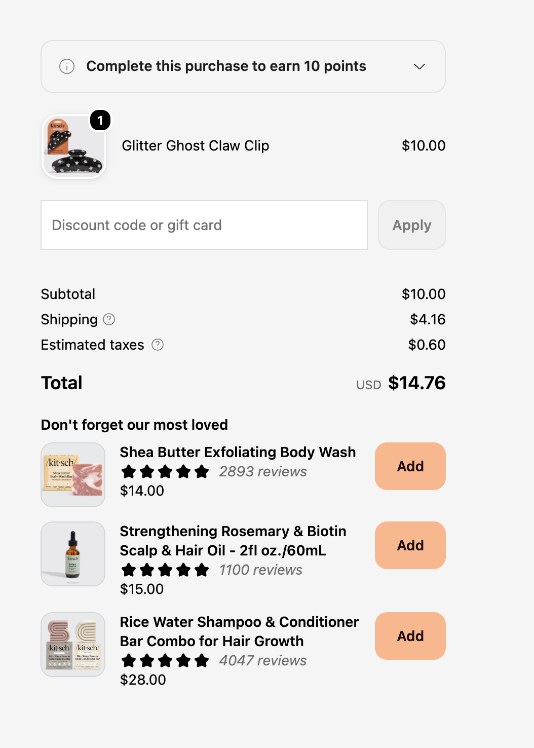
Kitsch acts as a great example of strategically matching the offer type to the moment. As a brand focused on both haircare and strategic offer usage… care, Kitsch continuously tested and learned with Aftersell’s A/B testing tools, focusing on multi-product upsells of related hair products.
The results were just as clean and satisfying as their customers' hair: 20% month-over-month growth in AOV and conversions, a 17% increase in revenue per visit, 17% more accepted offers, and more.
Show total costs before payment
Next, make the total price predictable. Show shipping costs, shipping fees, taxes, and other extra costs before shoppers enter payment information.
Unexpected costs at the final step are especially damaging because they make the online store feel less transparent. Clear messaging around delivery timing, discount codes, and return policies helps shoppers understand the deal before they commit.
Offer flexible, secure payment methods
Offer payment options that match how people already shop. Alongside a standard credit card flow, relevant payment methods may include Apple Pay, Google Pay, or a pay later option.
Keep payment details concise and reinforce security with a PCI-compliant payment setup, current SSL certificates, and recognizable trust badges. Those signals address security concerns and help build trust without adding more steps.
Offer dynamic discounts when they count
It’s easy to fall into the trap of running too many steep sitewide discounts.
While they’ll likely spike short-term sales, they’ll also train your customers to abandon their carts and wait for the next discount code.
Instead, treat discounts as a targeted tool: aim them at shoppers who are hesitating, and hold them back from the ones who are going to buy anyway. This is where dynamic discount strategies can improve cart recovery effectiveness and while ensuring you avoid training all of your customers to wait for a code.
That same logic should shape every incentive in your flow. A small, well-placed discount at checkout can signal value and lift acceptance, but the size and timing should depend on the moment itself. A first-time visitor stalling at checkout is likely worth a nudge, but a repeat customer who has already shown they’ll buy usually isn’t.
It often makes more sense to let value do the job you think a discount needs to do. A free-shipping threshold, a bundle, or a free gift can nudge someone over the finish line without cutting into your margins.
Back the offer with relevant trust signals
As Ernest Hemingway once said, “The best way to find out if you can trust somebody is to trust them.” And as we say at Aftersell, “We agree with Hemingway.”
Social proof and trust signals are two of the strongest ways to show customers they can trust what you’re offering.
Star ratings on a recommended product are a great way to highlight the strength of your offer. Trust badges near the payment field are another strong play, with common ones including:
- Payment badges like PayPal, Visa, Mastercard, and American Express
- Secure checkout badges
- Money-back guarantees
- Free returns
- A “trusted by XXXX+ customers” line
- Customer reviews from platforms like Google, BBB, and Trustpilot
Using Aftersell, you can add product review stars and set a minimum rating so only well-reviewed products are shown. Testimonials can also automatically pull reviews to match what’s in a shopper’s cart, giving them reassurance that’s directly relevant to the exact product they’re buying.
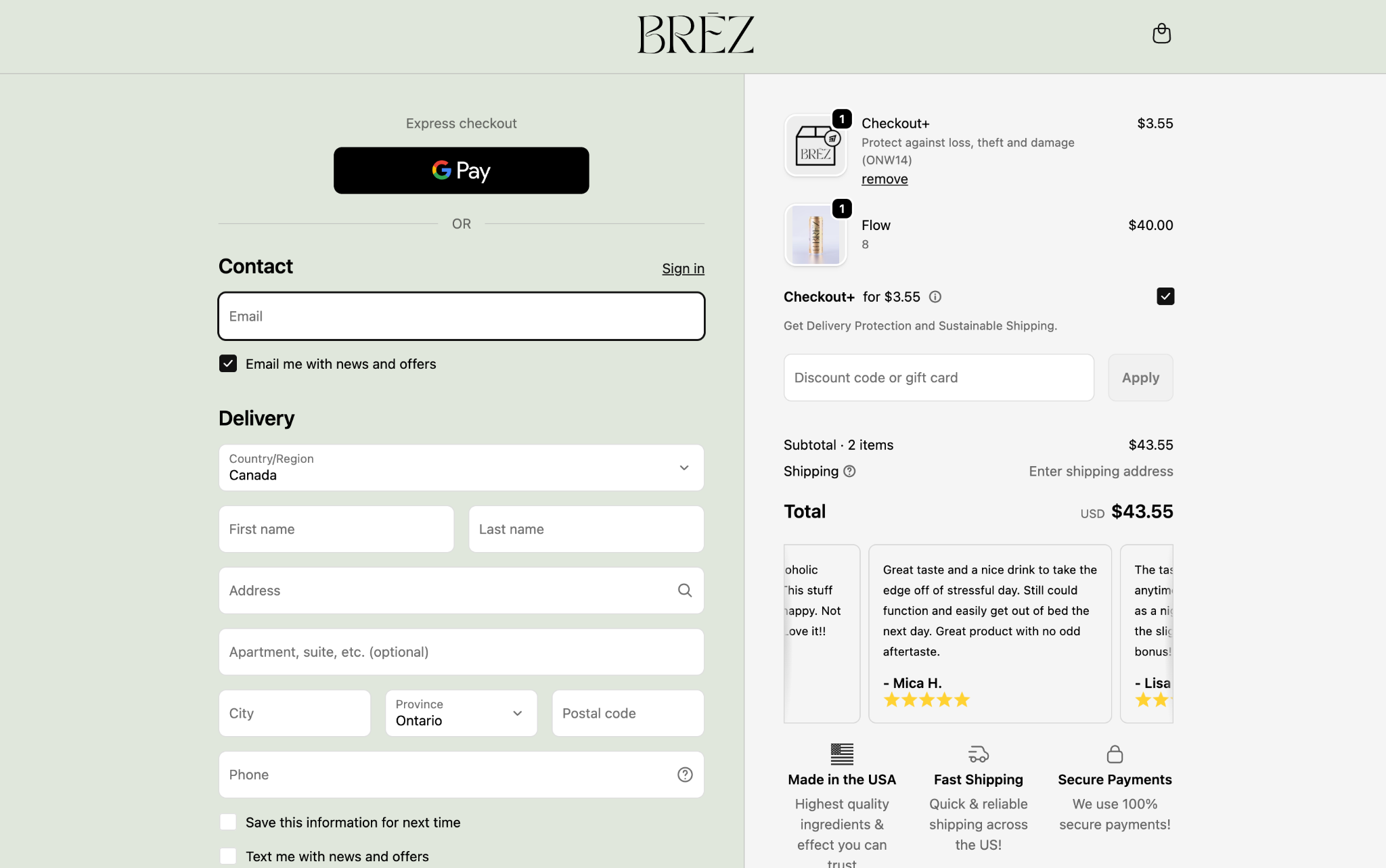
Cannabis drink brand Brēz gets five stars for its use of customer reviews. Using Aftersell, they began showing customer reviews on the checkout page to validate the customer’s decision and move them closer to clicking that buy button.
Show the right offer to the right shopper
The more relevant the offer, the less it feels like an upsell.
Before you start building any fancy targeting, set your primary widgets to show to all customers. That way, every session will see your offer, and you’ll have a nice, clean baseline to measure against.
Then, start segmenting with triggers. For example:
- Surface a complementary upsell when a specific product or collection is in the cart
- Show the rewards bar only when the subtotal is within range of the threshold
- Tailor offers by shipping country, language, customer tag (loyalty, VIP, wholesale, and so on), or device
If you want even tighter logic, you can combine conditions. For example, you could show a certain upsell only when a cart contains a specific product and the subtotal is above $50. With this level of granularity, shoppers will almost never see an irrelevant offer.
Track the metrics that reveal drop-off
Measure the full funnel, not just accepted offers. Useful metrics include the cart abandonment rate, checkout abandonment at each step, conversion rate, completed purchases, AOV, and estimated lost sales. Break out mobile versus desktop and first-time versus returning shoppers so one strong segment does not hide another segment’s drop-off.
Test one variable at a time
Run an A/B test when you change placement, messaging, or functionality, and isolate one meaningful variable at a time. Your own baseline should lead the decision; external research from sources such as the Baymard Institute can provide useful context, but your shoppers’ behaviour is the final word.
Optimize your checkout flow and catch shoppers before they leave
A customer randomly deciding they don’t want your product anymore is still pretty rare. But a customer bouncing because your checkout was convoluted, didn’t inspire confidence, or simply gave them a reason to hesitate? That’s pretty common.
While you’ll never solve those fringe cases, checkout optimization will help you decrease cart abandonment by fixing the reasons most shoppers actually leave. Reduce cart abandonment first, then make the high-intent moment work harder — in that order.
If you’re interested in what Aftersell can do for your checkout, you’ve come to the right place. Book a demo or start a free trial, fill those potholes, and give your customers a smooth, open checkout road to drive on.
Recommended Reading
.jpg)