As an ecommerce brand, naturally your main goal is to take the dark lord Sauron’s cursed ring and throw it into the fires of Mount Doom to end his reign of evil forever, right?
Just kidding. Your goals probably include optimizing your customer journey to boost conversion rates and sales. And there’s no better way to do this than with checkout optimization.
But while website optimization can definitely boost conversion, many teams are focusing on the wrong page.
It might seem easier to make quick changes to your homepage with the hope of immediate results. You can update headlines or imagery, A/B test CTAs, or do a slight branding change in minutes.
And sure, these changes can improve conversion. But the real trick is going where your high-intent users are already engaging to gain even greater increases in conversion.
Checkout is the most revenue-focused area of your site. It’s where your users are the most engaged in the funnel. Yet it’s often neglected.
Here’s why it’s worth it to invest in optimizing the checkout experience, and deliver a higher ROI using a few simple strategies.
Conversion benchmarks you should know
First, how are you stacking up to the competition?
The average conversion rate for ecommerce is 1.4%. Rates over 3% are considered above the industry average.
And for Shopify stores, here’s what recent industry insights say:
- The average conversion rate for Shopify was 1.4%
- Anything more than 3.2% puts you in the top 20% of Shopify stores
- Anything more than 4.7% puts you in the top 10%
These numbers provide a helpful benchmark for ecommerce teams evaluating whether their checkout flow and overall online store performance are optimized for today’s online shoppers.
What is homepage CRO?
Conversion rate optimization (CRO) is a marketing strategy to boost conversion on your ecommerce site. Your conversion rate is your total orders divided by website visitors.
Homepage CRO means optimizing specific areas on your homepage to move users through the funnel and drive conversion.
These strategies can be as simple as changing the CTA copy or using more eye-catching imagery. They can also be more strategic, like adding pop-ups, testing different offers, or simplifying copy.
Homepage CRO always gets the most attention because it’s easier to see changes instantly. Changing your homepage is seen as less risky than making changes at checkout, which feels more behind-the-scenes.
But nothing ventured, nothing gained. What’s life without a little risk?
What is checkout optimization?
Checkout optimization is the process of improving the ecommerce checkout process to reduce friction, increase checkout conversion rates, and minimize cart abandonment. This includes improving the checkout form, offering flexible payment methods, simplifying form fields, and streamlining the checkout flow so customers can complete purchases faster.
According to recent insights, the average checkout completion rate is 45% on Shopify.
To increase your checkout conversion rate, you can improve features like the checkout form, overall user experience, or design. Brands often also add incentives like a free shipping threshold, upsell offers, or flexible payment methods such as BNPL (buy now, pay later).
Your ultimate goal is converting site visitors into customers. The checkout page is the bridge between a potential sale and a completed purchase, after all.
Based on our data at Aftersell, the average checkout conversion rate is an impressive 55.48%. This means that more than half of all customers who start the checkout process complete their purchase.
But top-performing brands are pushing this even higher with optimized checkout flows designed to minimize drop-off and improve the customer experience.
Even if you have no major issues or friction points, ecommerce checkout optimization can help unlock hidden revenue streams—like cross-sells, upsells and checkout offers—while also increasing average order value.
Why checkout optimization matters more
Your checkout is the most critical part of your funnel.
At this stage, only the most engaged, high-intent users on your website are there and they’ve likely already decided whether they’re buying. It’s the perfect chance to capture more revenue streams from these users.
Plus, any checkout optimization can directly increase revenue without extra costs. By using a few simple optimization strategies, you can:
- Identify data points that reveal where customers decide to upsell or cross-sell
- Discover what items paired together gained additional revenue
Friction points that kill conversion at checkout
In a perfect world, your funnel will seamlessly guide site visitors from a product page to checkout and conversion every time.
In reality, the average cart abandonment in ecommerce is 70%. Cart abandonment can happen at any time, with checkout being a top spot in the funnel for abandoned carts.
Maybe it’s because of unexpected shipping costs, forced account creation, slow load times, lack of trust signals or a complicated checkout form. Whatever the case, there’s no guarantee that customers who abandon their carts will return—even with a solid win-back strategy.
If you're seeing increased cart abandonment at checkout, you need to focus on checkout optimization. Watch out for these friction points that kill conversion.
Unexpected costs
It’s estimated that 39% of consumers abandon their cart because of extra costs like shipping or high taxes.
Solution: Be transparent with your customers. Clearly communicate pricing and shipping costs upfront to meet customer expectations and reduce friction. This helps ensure there are no surprise costs that make them second-guess their purchase.
Forced account creation
19% of consumers abandoned their cart because the brand forced them to make an account.
Forced account creation can be a hard no for shoppers. It’s an added step that creates unnecessary friction during the checkout process.
Solution: It’s simple—skip it if you can. Offer guest checkout options or a guest checkout experience so customers can purchase without creating an account.
Limited payment options
10% of consumers abandoned their cart because there weren’t enough payment methods.
Solution: Make sure your customers know they’re able to check out with flexible payment options including Apple Pay, Google Pay, PayPal, credit card payments, digital wallets, and buy now pay later (BNPL) solutions.
Offering multiple payment methods helps improve customer satisfaction and reduces friction during the payment details stage of checkout.
Lack of trust signals
Nothing kills conversion like a lack of trust. It’s estimated that 19% of consumers abandoned their cart because they didn’t trust the site enough to enter their credit card information.
Solution: Add visible trust signals like security badges, SSL certificates, customer reviews, and social proof. These elements help build trust with online shoppers and reassure them that your online store is secure.
Top 6 checkout optimization strategies
Now that you know what not to do, time to dive into some simple checkout optimization strategies to boost conversion.
1. Simplify your checkout form
Long, complicated checkout forms are one of the fastest ways to lose a sale.
The more form fields customers have to complete—such as billing address, shipping address, phone number, and other details—the more likely they are to experience frustration or abandon the process.
A more user-friendly checkout focuses on only the information required to complete the order. Many brands also reduce friction by using autofill, real-time validation, and clear error messages to help customers complete fields quickly.
Simplifying the checkout form improves the overall user experience and can significantly reduce checkout drop off.
2. Add upsell offers
NO—upsell offers do not hurt your conversion rate. We just talked about simplifying the form, but upsell offers allow shoppers to add complementary items to their orders. With the right UX, they don’t add noise.
Upselling and cross-selling quietly drive a whopping 10 to 30% of total revenue for ecommerce brands.
It’s important to note that for checkout upsells to drive conversion and revenue, you need to deliver real value to customers. Try featuring relevant products, limited-time offers or checkbox add-ons right at checkout.
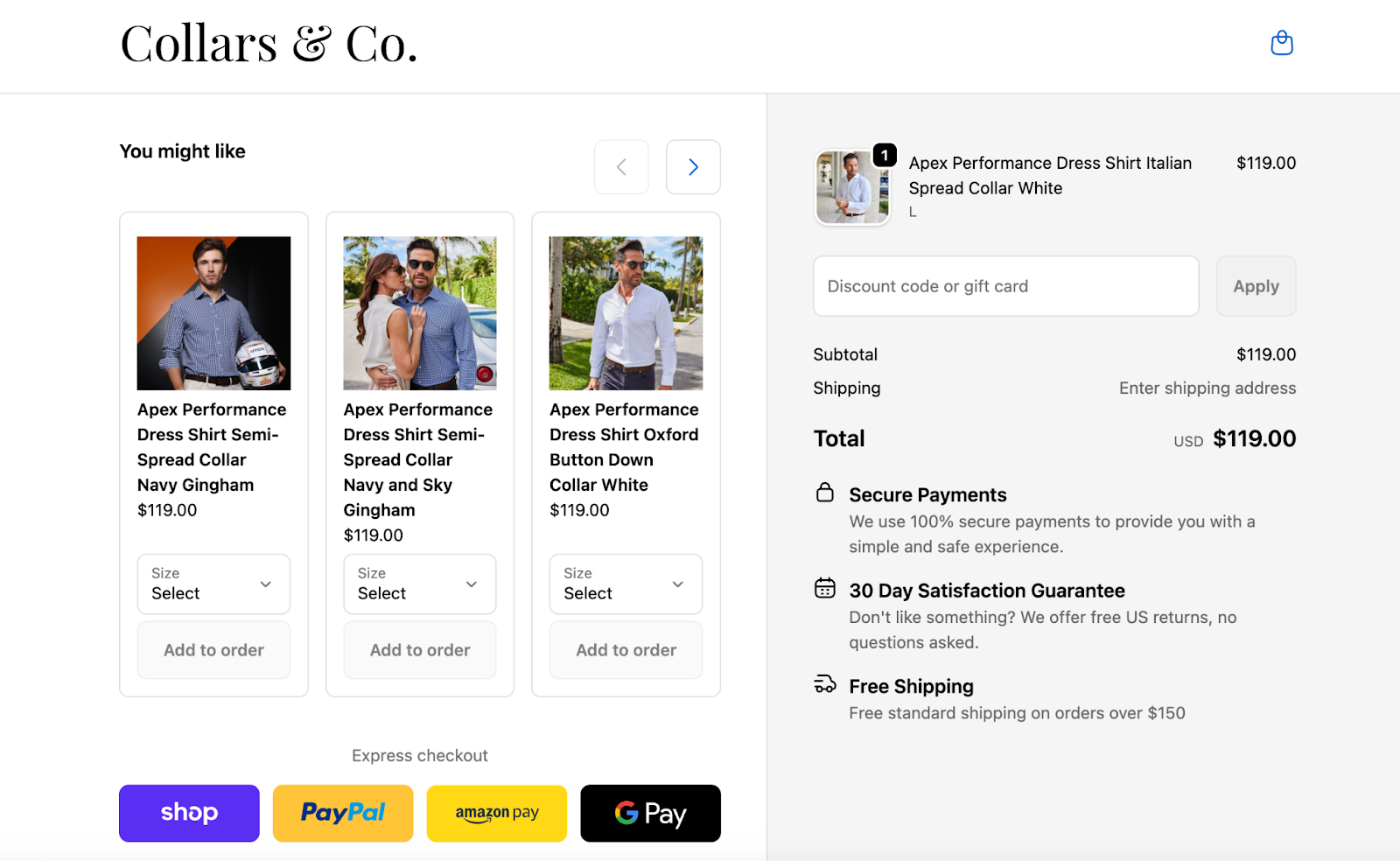
For example, sleek and stylish men’s apparel brand Collars & Co. uses upsell offers that complement what’s already in a customer’s cart. And it pays off big time with results like:
- $100,000 increase in total incremental monthly revenue
- 27% take rate on checkout offers
3. Use smart nudges
Smart nudges show customers how close they are to an incentive offer, like free shipping thresholds or other perks.
You might display a progress bar or progress indicators that show shoppers how close they are to unlocking free shipping or a discount.
The best part is they’re shown right at checkout, so they don’t interrupt the customer experience.
This simple but powerful nudge can drive a higher average order value, incentivizing customers to hit a certain threshold.
4. Highlight trust signals
Trust is everything, so communicate trust with your customers.
Try to display security badges, customer reviews, delivery timelines and any information that builds trust with your customers. A checkout page is the perfect opportunity to do this.
Why? It helps reduce hesitation to keep conversions high.
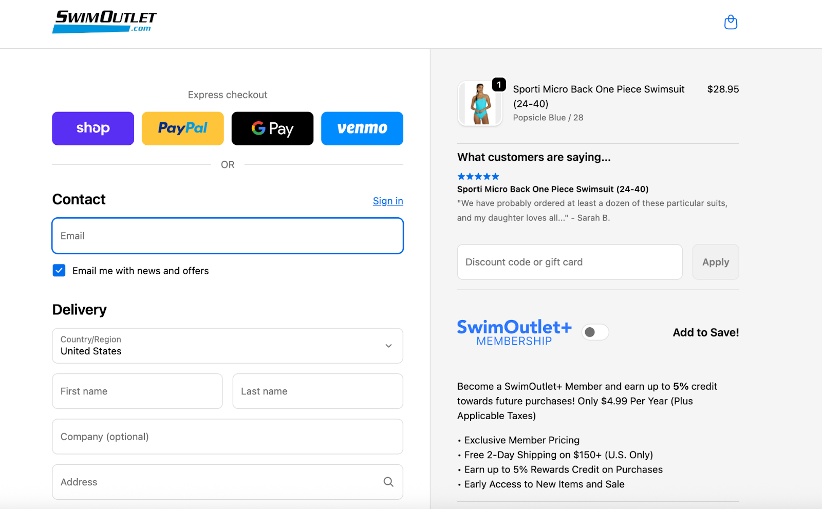
Swim Outlet offers customer reviews that relate to each product a customer adds to their cart. Their checkout layout features a membership offer, trust signals with customer reviews and various ways to pay.
Overall, it’s a seamless checkout page that reduces friction and doesn’t have too many elements on the page.
5. Optimize checkout for mobile devices
More than half of ecommerce traffic now comes from mobile devices, which makes mobile checkout optimization essential.
A well-designed mobile checkout experience should:
- Minimize typing
- Use autofill where possible
- Support digital wallets
- Keep the checkout layout simple
- Reduce load times
Mobile shoppers often have less patience than desktop users, so a smooth checkout flow is critical for maintaining conversions.
6. Use progress indicators to reduce uncertainty
Customers like knowing how close they are to completing their purchase.
Adding a progress bar or progress indicators to the checkout process shows shoppers exactly where they are in the journey—from shopping cart to payment details to the final step.
This reduces uncertainty and helps customers feel more confident continuing through the checkout flow.
7. Above all—keep it simple and on-brand
As a wise man once said: you do you.
Keep your checkout page simple and on-brand to create a user-friendly, optimized checkout experience.
With Aftersell’s no-code Checkout Designer, you can easily control the look, feel and functionality, from colours and fonts to layout and messaging.
You can also try different layout combinations and test which performs best across mobile devices and desktop users.
And remember: what works for one brand may not work for yours. Find your unique identity and embrace it.
Top-performing checkout layouts to learn from
Take a look at these examples for two top-performing checkout layouts.
1. Testimonials + rewards + images + upsells = $1.40 revenue per session (RPS)
2. Text + testimonials + cart controls + trust badges + images + upsells = $2.18 RPS
Looking for even more inspiration? Explore Aftersell’s industry report for more examples.
Stop losing revenue at checkout—try Aftersell
Everything in your funnel leads to checkout. So stop ignoring it.
By improving your checkout process, streamlining the checkout flow, and reducing friction in the checkout form, brands can significantly boost conversions and improve customer satisfaction.
Ready to get more out of your checkout? Try Aftersell for 30 days or book a call with us to get started.
Recommended Reading

.png)