.jpg)
You did everything right. You paid for the click, caught their attention, and got them all the way to “Add to Cart,” and into their cart. Then they just … disappear.
Sound familiar? You’re not alone.
Abandoning carts is a common experience for all online shopping. And Checkout is the final step where revenue either converts or slips away. Honestly, most brands see that their checkout is breaking, but not understanding where exactly or why.
That’s where this gets interesting. Aftersell has visibility across 40,000+ Shopify brands, which means we’ve seen exactly what works, what doesn’t, and where shoppers tend to drop off during the checkout flow.
We’ll show you the best ways to optimize checkout, turning previous drop-offs into conversions.
What is checkout page optimization and why does it matter?
Your ecommerce checkout page is where revenue is either won… or quietly walks out the door, so it's kind of a really big deal to streamline the experience.
Ecommerce checkout optimization is all about removing friction in those final steps, cart, shipping, payment, confirmation, so the people who already decided to buy actually follow through.
It sounds simple, but it’s where details matter most: clean layouts, fewer form fields, transparent pricing, flexible payment options, and trust signals that make customers feel confident hitting “Place Order.”
The true cost of abandoned carts
The reality is that nearly 70% of carts are abandoned, which is no small leak. It's actually a revenue flood, costing retailers around $18 billion every year. And it’s important you understand what these behavior signals are saying.
In good news, a lot of it is preventable. Research shows that better checkout design alone can lift conversions by 35%+, unlocking massive revenue that’s already within reach.
With Aftersell, top-performing brands are proving it. Aftersell’s benchmarks show:
- Checkout conversion rates hitting 55%+ versus a 45% industry average.
- Cart-to-checkout progression at 10% versus a 1 to 4% industry average.
Making it more apparent than ever that you don’t always need more traffic, you need to convert the traffic you already have.
Checkout process optimization is just one way of lifting revenue, but there are more. Check them out here.
Friction: The conversion killer
Think of checkout like the final stretch of a race: you’ve done all the hard work, and now every tiny obstacle matters.
Every friction point is a potential drop-off. Things like an extra form field, a surprise shipping fee, or a missing trust signal can be just enough to make someone second-guess and leave.
And another thing… not all abandonment is created equal:
- Browse Abandonment. They looked but never added to cart
- Cart Abandonment. They added items but didn’t start checkout
- Checkout Abandonment. They started checkout… and still walked away
That last one hurts the most. It’s the highest-intent moment and the most expensive to lose.
It may hurt the most but it’s also the easiest to fix. A few smart checkout optimizations can turn near-misses into real revenue.
Want to know how to take your checkout experience to the next level? Aftersell’s got you covered.
Ecommerce Checkout Best Practices
Not all best practices are created equal, here are the ones that convert.
1. Simplify the flow
At this stage, your shopper is ready to buy. So don’t make them overwork for it.
Ask yourself, “Do you actually need this to fulfill the order?”. If the answer isn’t a clear yes, cut it or at least make it optional.
Easy wins to simplify flow:
- Hide “Company” and “Address Line 2” behind dropdowns
- Use autofill + address lookup
- Stick to a clean, single-column layout
- Show the right mobile keyboard for each field
Small tweaks make the biggest differences.
2. Reduce anxiety on mobile
Design for mobile, because that’s reality. On Aftersell, almost 73% of post-purchase orders happen on mobile, so optimize there first.
What does that look like? Focus on:
- Load speed under 3 seconds
- Thumb-friendly buttons
- Progress indicators so the checkout process feels short
- Inline error validation… and never reset a shopper’s progress after an error.
Because one bad moment is all it takes to lose the sale.
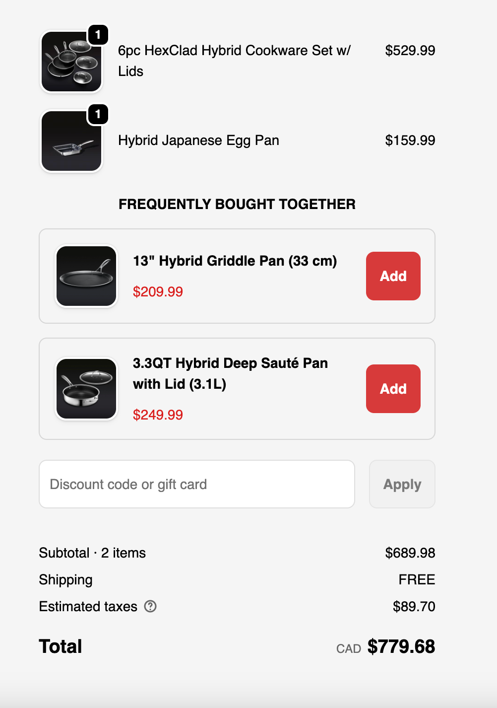
3. Be upfront about shipping costs and timelines
If we’re talking about obstacles in the way of making a sale, we have to talk about unexpected costs.
Shoppers don’t mind paying for shipping or tax. What they do mind being surprised by it at the very end. In fact, nearly half of abandoned carts happen because of extra, unplanned costs.
The fix? Go with the best policy.
- Lead with honesty. All-in pricing early in the journey, instead of at the final step. Surface shipping, taxes, and fees before checkout and reinforce it with a free-shipping threshold bar to keep momentum high.
- Set clear expectations. Tell shoppers exactly when their order will arrive, and give options like express or priority shipping to reduce hesitation.
Brands like HexClad do this well by showing full costs upfront so nothing feels hidden when it’s time to buy.
4. Offer trustworthy payment options
Credit card isn’t the only payment option, and the payment step is where hesitation peaks.
Shoppers are about to enter sensitive information, especially on higher-value purchases, and they want one thing: reassurance.
Show them it’s safe and worth it by surfacing trust signals like:
- Certified security and payment badges
- Clear return or refund guarantees
- Easy-to-find support (live chat or contact)
- Relevant reviews or UGC tied to what’s in their cart
- Various payment options and digital wallets like PayPal, Apple Pay, Google Pay, or even pay later
These signals turn uncertainty into confidence.
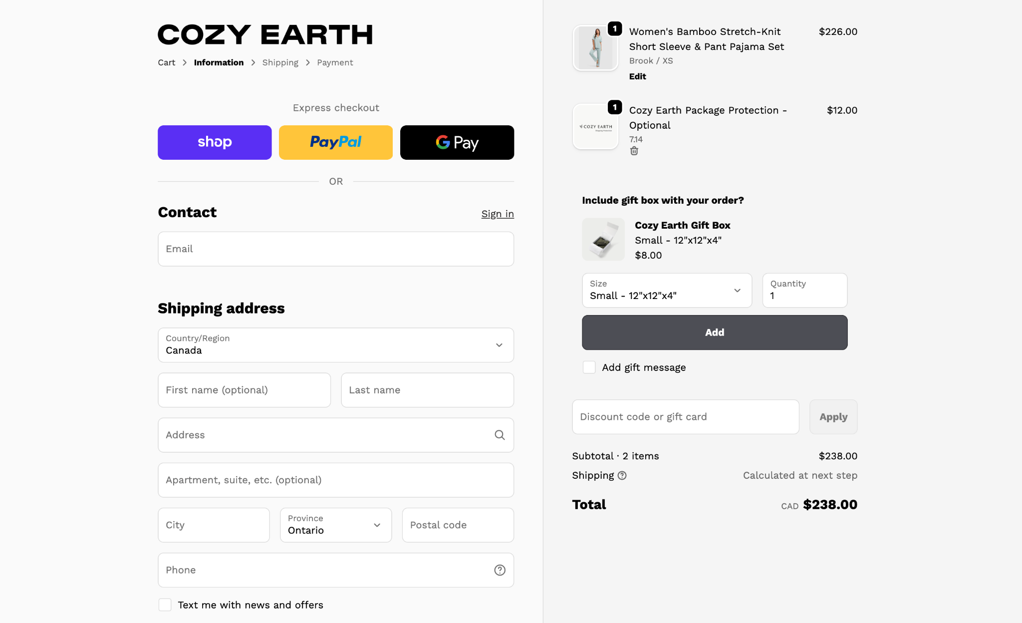
If you want to see this done well, take a look at brands like Cozy Earth. Cozy Earth pairs visible security badges with optional package protection, making the entire experience feel secure, supported, and risk-free.
5. Build trust to increase shopper confidence
Checkout is when that little voice of doubt, “Do I really need this?” starts getting louder.
Your job? Flip the focus from cost to value.
Make savings impossible to miss:
- Show Original Prices. Use strikethrough with a bold sale price
- Add Sales Badges. Use clear signs like “30% off”
- Reinforce Value. Use a running total like “You’re saving $24 today”
- Celebrate Milestones. Make known when shoppers unlock thresholds or free sample
The goal is simple: remind shoppers they’re getting a real win.
Be smart with discount codes, too. A big empty promo box is basically an invitation to leave and hunt for a deal, and they don’t always come back. Instead, auto-apply sitewide discounts so the savings feel instant and effortless.
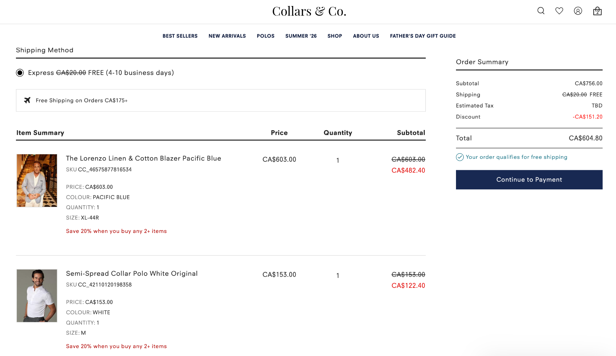
Brands like Collars & Co. do this well. The premium brand uses bold, high-contrast pricing to make the savings stand out more than the spend.
Because at checkout, perception is everything.
6. Lead with social proof at the decision moment
At checkout, shoppers aren’t really looking for more information, they need proof that they’re making the right decision.
Instead of sending shoppers back to your product pages to re-convince them, bring the proof directly to them.
Surface social proof right where the decision happens:
- Visual Displays. Star ratings tied to the exact product in their cart
- Surface reviews. Find compelling, short, relevant reviews
- Push for bundling. “Customers also bought” recommendations for added confidence
The key is relevance. Generic, sitewide ratings won’t do much. But product-specific proof feels personal and reassuring.
Checkout page optimization goes hand-in-hand with upselling. Leverage Aftersell’s Upselling Playbook.
7. Make guest checkout the easy choice
Forced account creation can interrupt intent, while a guest checkout option helps potential customers move forward faster.
Keep the checkout form fields to the minimum you truly need, enable autofill, validate entries in real-time, and use progress indicators when checkout spans multiple steps.
You want shopping at your ecommerce business to feel easy, from the point someone lands on your store all the way through to getting to the order confirmation page.
8. Highlight final offers and upsells
Checkout isn’t just your last chance to secure the sale. It can also be one of your best opportunities to increase its value.
But there’s a catch: where you show the offer matters, a lot.
In Aftersell’s Revenue Leak Report, data across 40,000 brands found that upsells placed right before the “Complete Order” button saw a 6.96% offer acceptance rate. Put the offer after payment methods, and acceptance dropped all the way to 0.18%. That’s nearly a 40x difference based largely on where the offer appears in the checkout journey.
Why? Timing.
Right before shoppers complete their order, they’ve already made the big decision to buy. A small, relevant add-on feels like an easy “why not?” But once they’re entering payment details, another decision can feel more like friction than value.
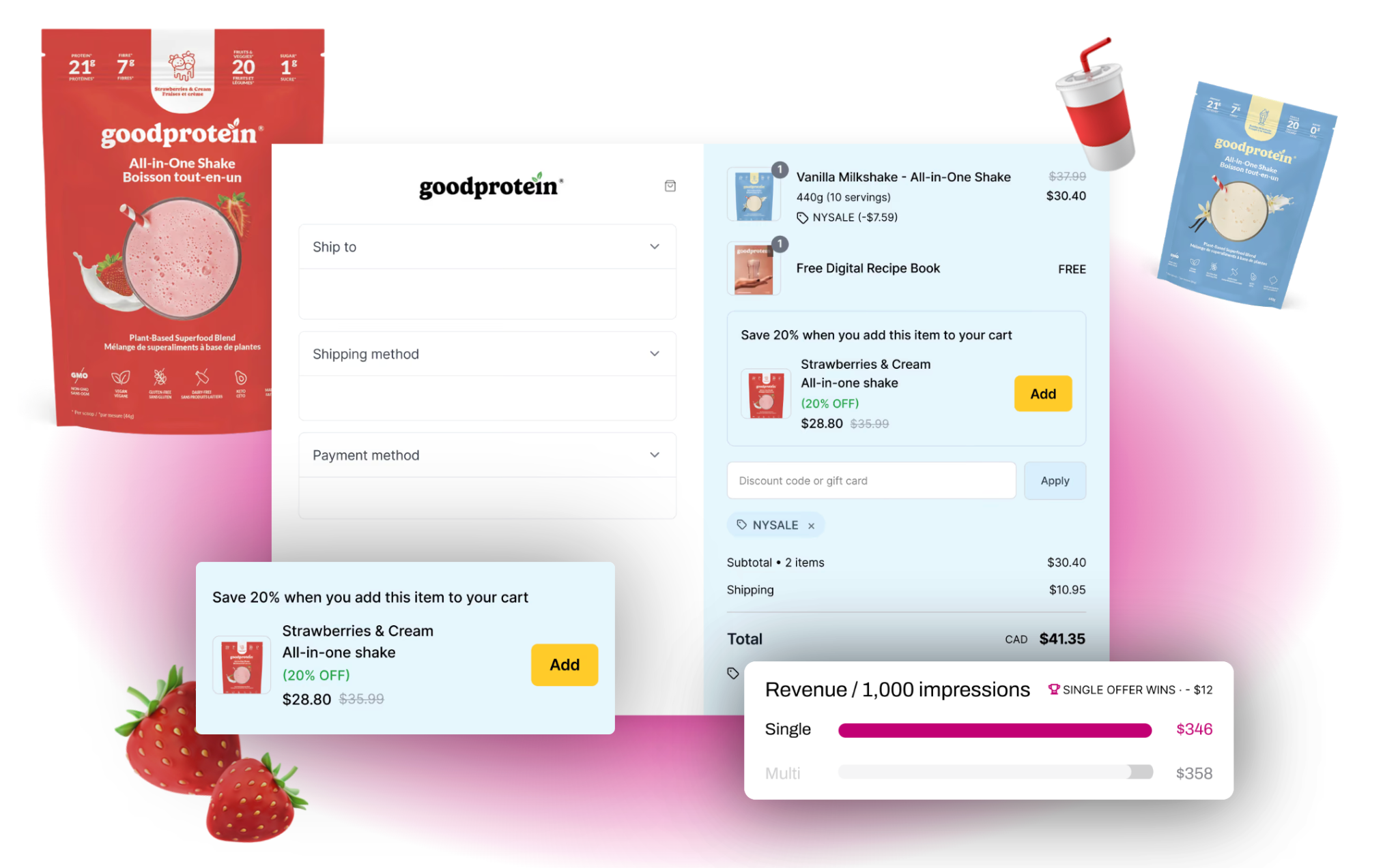
You can always run a few A/B testing models to see which placements increase conversion rates the most. But for a good rule of thumb, when it comes to your online store’s checkout match the offer to the moment:
- Use low-friction, impulse-friendly add-ons near the “Complete Order” button
- Keep recommendations closely related to what’s already in the cart
- Make adding the offer quick and easy
- Avoid interrupting shoppers once they’re focused on payment
For higher-ticket offers, there’s another opportunity. Aftersell’s data found that the generic checkout block produced a $43.58 average order value (AOV) on accepted offers and the highest revenue per impression, despite having a lower acceptance rate.
The takeaway? Don’t just ask what you should upsell. Ask where the customer will be most receptive to it.
Testing and iteration: Measure the KPIs that matter
If you want to reduce your cart abandonment rate, think of your checkout like a science experiment: you don’t guess, you test.
Instead of changing everything at once, tweak one friction point at a time: guest checkout visibility, form length, badge placement, even where your Apple Pay button sits. Small shifts, big insights.
Then watch what actually moves the needle.
Track the metrics that tell the real story:
- Checkout start rate
- Step-by-step completion
- Payment success rate
- Form drop-offs
- Error rates
- And recovery-email click-through rate
Because the best-performing checkouts are constantly evolving alongside consumer behaviour trends.
Test, learn, tweak… repeat.
Stop losing customers at the finish line
Before you chase bigger carts, fix what’s broken first in your customer experience. Remove friction, boost conversion, and make checkout feel effortless and hassle-free.
Getting more people to complete purchases will always beat trying to squeeze more out of fewer.
Here’s your action plan:
- Map Drop-Off. Find where customers are falling off first
- Simplify The Flow. Cut every field that isn’t essential
- Default To Guest Checkout. Earn the account after the sale
- Design Mobile-First. That’s where most shoppers are
- Show Shipping Costs. Transparent pricing and timelines, supported by a free-shipping bar
- Build Trust At Payment. Reinforce value with visible savings and perks
- Add Tailored Social Proof. Proof right at the decision moment
The smallest tweaks here can turn almost-sales into actual revenue.
Curious what best-in-class looks like? See what Aftersell can do for your checkout page
Recommended Reading